A bit of background
Last year, we discussed the General Court’s decision partially to annul three decisions on the comparison of 3D Champagne bottle marks. In a nutshell, the Court held that the distinctiveness of a 3D shape should be assessed by taking into account the sign as a whole, including elements (or lack of elements) which are seemingly negligible.
Recently, further guidance from the Fifth Board of Appeal (the Board) in relation to the registrability of 3D shapes (specifically in the drinks sector) has come to light. This follows an EUIPO examiner’s decision to refuse registration of a vodka bottle as a 3D shape mark on the basis of non-distinctiveness, the elements not being outstanding or eye-catching enough to create an overall impression that would significantly depart from the customs and norm of the relevant market. The examiner also considered that the average consumer would perceive the packaging as “a mere variation of a container” (and not as a sign of origin).
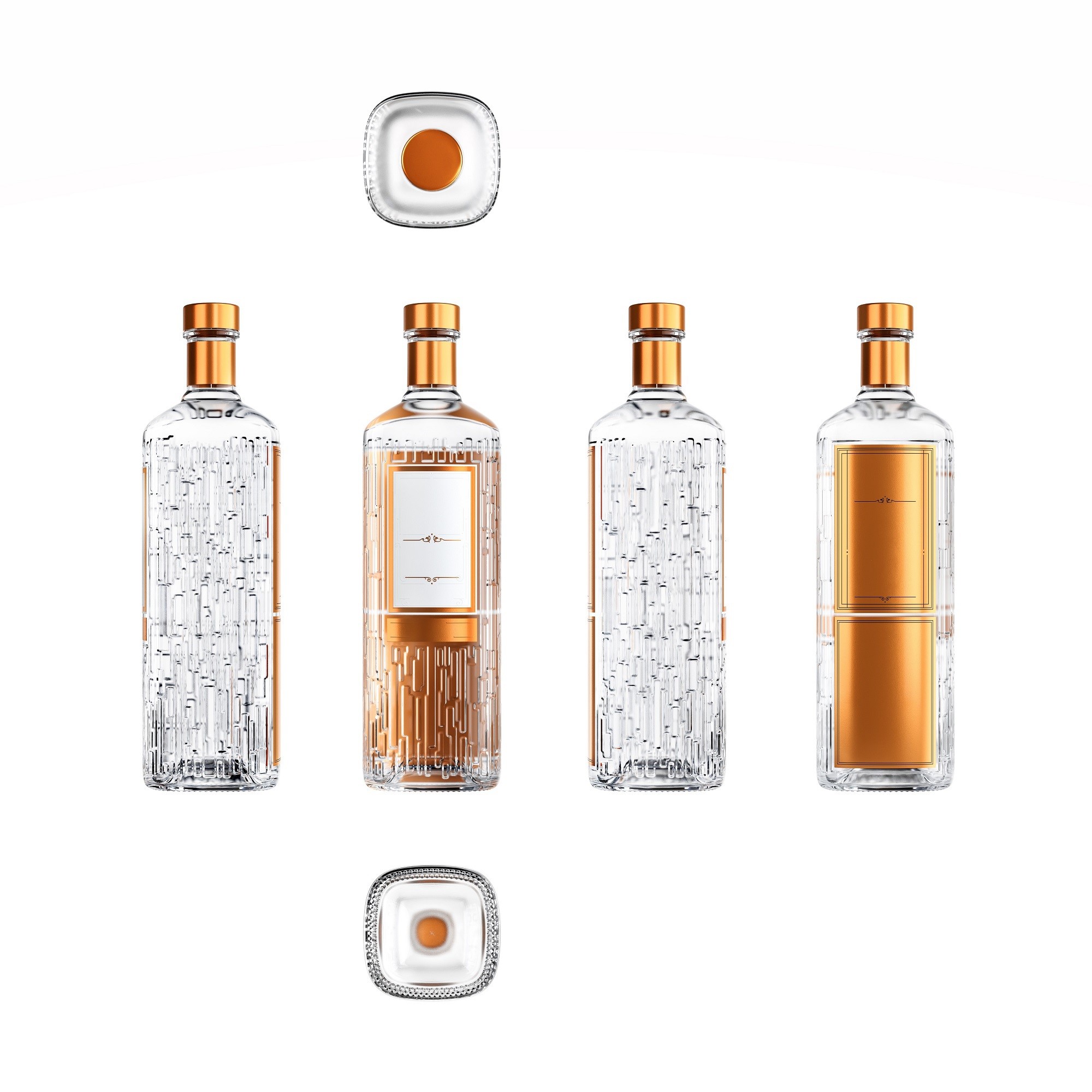
This case was brought to the Board by the Applicant, vodka giant The Absolut Company Aktiebolag, in relation to the following mark:
 |
When reassessing the shape mark’s registrability, the Board singled out the following particular elements:
-
The copper-coloured closure of the bottle.
-
The body structure and further features (such as the short neck, conical bottle shoulder, bottle structure and proportions).
-
The surface design consisting of a seemingly “striking” crystal-like structure.
-
An unusual copper back to the bottle which can be seen through to the front due to the transparent vodka.
-
The front label consisting of a prominent copper-coloured frame.
-
The copper-coloured neck foil/wrapper.
The Board was of the opinion that elements A-C were not particularly distinctive.
Elements D-F, however, would “not go unnoticed by consumers” and had a “strong impact” on the way consumers would perceive the whole shape of the bottle. The Board stressed that the shared colouring (copper, brown and gold shades and nuances) meant that elements D-F worked together in such a way as not to be considered too complex to be remembered by consumers. Rather than being purely “decorative”, the colour scheme would, due to its size and predominance, be seen as “eye-catching and striking”.
Individually, the elements may be banal and play a negligible role in assessing distinctiveness but this changes when these elements are assessed together. This follows the previously reported Champagne bottle decision which states that the distinctiveness of signs consisting of a number of elements should be assessed as a whole.
Other points to note include:
-
The Board acknowledged that the application sought registration only in relation to vodka but noted that the wider market (for example, alcohol) should still be considered when it comes to distinctiveness. In this particular case, the bottle structure was seemingly unusual for vodka bottles but was not unusual for alcoholic drinks in “neighbouring” markets, such as whisky and gin.
-
Given that the application mark had no verbal elements, distinctiveness should be assessed by taking into consideration the consumers in the whole of the EU. In relation to this case in particular, the Board stated that a consumer’s level of attention may vary depending on how expensive and accessible alcohol is to them in their country (for example, comparing Sweden and Spain).
The Fifth Board of Appeal annulled the refusal and allowed the mark to proceed to publication.
Conclusion and key take-aways
This case serves as a reminder that marks must always be considered as a whole; even if individual elements do not look hugely distinctive alone, together they may still create a distinctive mark which can be registered.
It remains to be seen, though, if this case will pave the way to greater acceptance of “non-traditional marks” (and, in particular, bottle shapes) before the EUIPO, considering the importance that colour (particularly the colour scheme’s cohesion) played in this decision. As ever, it all comes down to the facts of a specific case…
Get in touch
At Kilburn & Strode we have a team of Food & Drink enthusiasts who would be happy to answer any questions; please get in touch and join the conversation!
If you are seeking information or advice on trade marks or branding, please contact Rowena Tolley, Martina Ferro or your usual Kilburn & Strode trade mark advisor.